Creating a multi-brand design system with Tailwind
I’ve been diving deeper into design systems lately, and Figma’s latest feature announcement –which leans heavily into them – motivated me to create a small proof of concept for myself.
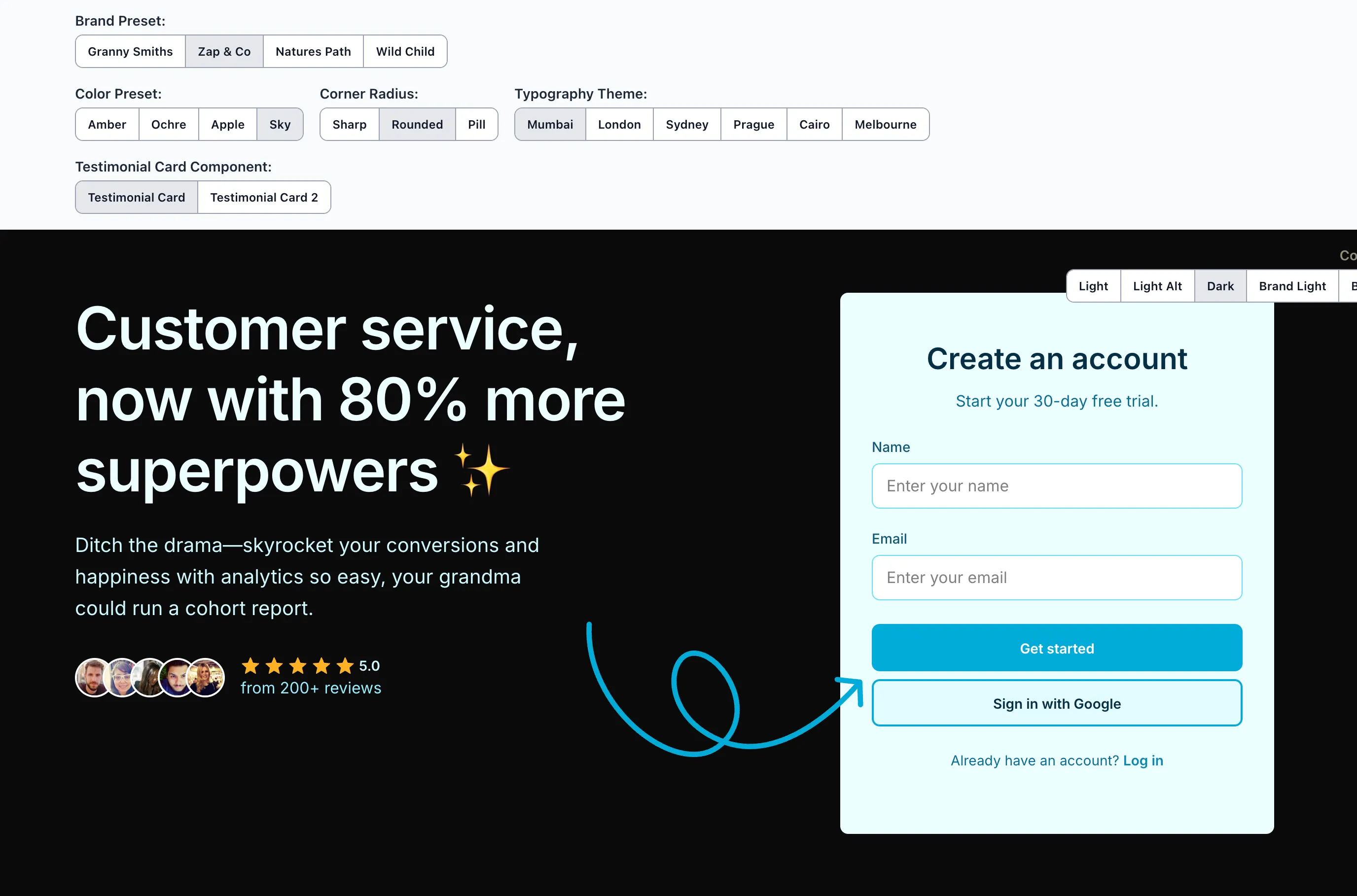
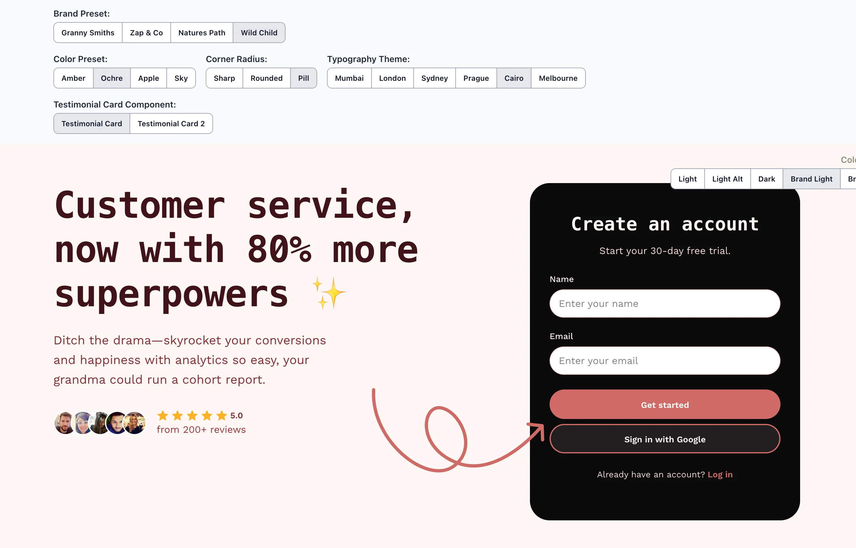
I wanted to build a system that allowed for multi-brand use based on a common set of variables. These would be defined at the root level, along with others that can be defined at the section/component level.
If that sounds interesting to you, check out the proof of concept here, and read further to see some of my learnings from building it.
Project specifications (ie. self-imposed limitations)
To ensure I didn’t spend an obscene amount of time on this proof of concept sprint, I gave myself a handful of parameters to work within:
- Stack – it must work with Tailwind, but otherwise be framework-agnostic
- Multi-brand – allow for changing of colour themes based on one primary brand colour
- Naming – tokens must follow a standardised naming convention
- Theming – the following themes should be available:
- Colour – offered in both brand and neutral options
- Corner Radius – offered in sharp, modern or pill
- Typefaces – a set of two typefaces should be allowed – one each for heading (display) and body text.
- Design – choose only 2 sections need to be built: a hero section and a testimonial section, for desktop & mobile only. Use a design library to speed up this project.
Challenges & learnings
There were a handful of challenges when building this proof of concept. Naming, inheritance, developer/designer experience, as well as technical feasibility are all things that need to be considered when building out a design system.
Here are the primary issues I encountered, and how I solved them.
Fighting Tailwind’s system
Tailwind itself is a design system, so adding another layout on top requires some consideration. This is not only from the technical implementation side of things, but also when thinking about the developer and designer experience.
While many may argue against the use of combining Tailwind with a design system – and they would be valid arguments – I decided to take it upon myself to figure out how it might be done regardless. Maybe I’m stupid, or maybe I like a challenge. We’ll see 🙂.
There were 3 options I considered:
Option 1: Override Tailwind tokens in the @theme directive
My initial thought was to set the variables using Tailwind 4’s @theme directive in the config. This is how Tailwind suggests you configure a theme in their docs, and would look like this:
/* This will set the 'rounded-xs' utility class to 8px */
@theme {
	--rounded-xs: 0.5rem; /* 8px */
}
The problem with this is that it’s not clear which tokens are default Tailwind ones and which are overrides. There would be overhead trying to remember which is which, and developers would need to keep referencing the Tailwind config file until they memorised which tokens were overrides. Then, would those overrides change per project?
<p class="text-xs font-semibold font-sans md:text-lg">
	Which tokens are from Tailwind, and which are from the design system?
</p>
So that system wasn’t going to work in this case.
Option 2: Namespacing the tokens
Another consideration was to still use the @theme directive, but add a namespace to signal that this token is part of the design system.
An example would be rounded-ds-sm, where ds (or whatever namespace you choose for your design system) would be added to every Tailwind class that is part of your design system.
@theme {
	--rounded-ds-xs: 0.25rem; /* 4px */
}
This is a good option as it keeps all the Tailwind defaults alone and adds your design system on top. We do, however, need to start our variable names based on Tailwind’s own theme variable namespace (eg. rounded-*).
Due to this, this method falls short when it comes to component-specific variables. If we want to define a border colour around an <Input> component, then do we name it border-ds-input? What about a testimonial background: bg-ds-testimonial ?
Personally, that looks confusing as we’re forced to use Tailwind’s prefixed naming convention (eg. rounded-*), and break out of the naming convention we want for components which is prefixed by the component namespace (eg. input-*).
This ultimately led lead me to my pick:
Option 3: Using Tailwind’s custom property syntax
Tailwind allows referencing of CSS custom properties (aka CSS variables) by wrapping the custom property name in parentheses – eg. bg-(--color-background).
At first glance this class is long (like we need more markup when using Tailwind 🙃), but it explicitly tells the developer that a token is being used. Not only that, but specifically which token is being used.
While Tailwind’s @theme directive would work, it is confusing when you’re mixing Tailwind variables with the design system variables. There’s no need to guess if a rounded-2xl is a Tailwind default or an override.
We can use Tailwind’s existing utility classes alongside the design system, and because we’re using Tailwind also means we can leverage utility classes to apply useful directives such as breakpoints:
<p class="bg-(--color-background) md:bg-none">
	Now we're combining design systems!
</p>
This means that onboarding developers who are used to Tailwind won’t have to unlearn it to navigate the design system. Tailwind utility classes can be used as per its defaults, and we can be explicit in which tokens are used from our design system.
Importantly, this method allows us to follow our naming convention for tokens – both global ones and component-specific ones.
:root {
	/* Global tokens */
	--color-text-primary: var(--color-brand-950);
	--color-text-secondary: var(--color-brand-800);
	/* ... */

	/* Component-specific tokens */
	--button-color-background-primary: var(--color-brand-500);
	--button-icon-color-primary-hover: var(--color-brand-50);
	/* ... */
}
Scalable colours that adapt to different themes
Another challenge was allowing for theme swapping on certain elements such as sections and components. Since there are handful of themes, both light and dark, colours need to adapt to each one. Text needs to be legible across all of the themes, yet we don’t want to limit the design so much so that everything looks the same.
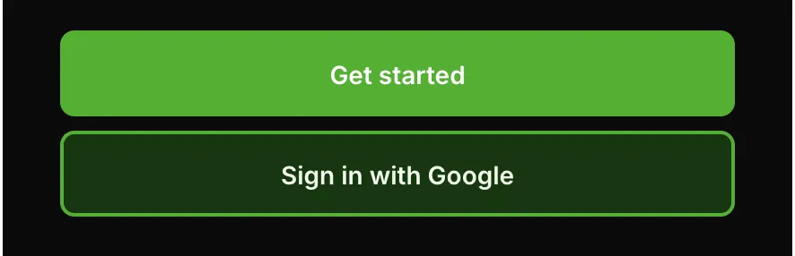
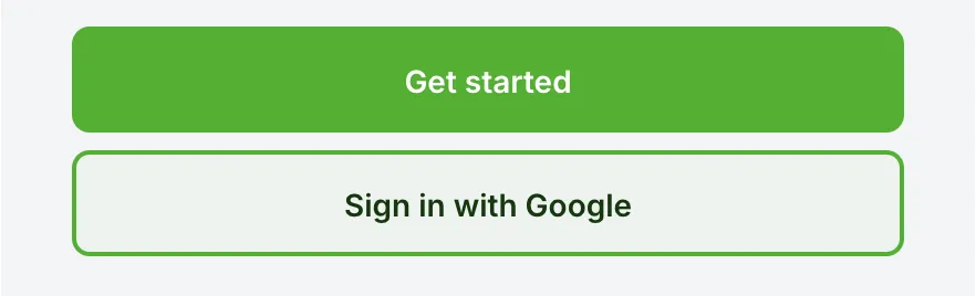
Take a look at the secondary button in this example (the “Sign in with Google” one), for both light-alt and dark colour themes:
[data-button-hierarchy='secondary'] {
	--button-color-background: var(--color-brand-50);
	--button-color-text: var(--color-brand-950);
	--button-color-border: var(--color-brand-500);
}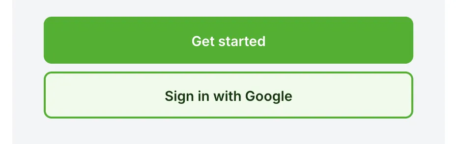
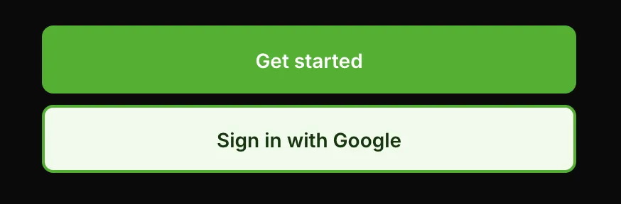
In the light-alt version, the background is a light shade of the brand colour. This looks fine on the lighter background, but on the dark background it suddenly looks too flat.
Of course this is subjective, but I want the system to offer the ability to give an outline only, but with a tint of the brand colour.
Styling based on the parent color theme
One option to get around this is to create CSS rules to style based on a parent element having data-color-theme="dark" applied:
[data-color-theme='dark'] [data-button-hierarchy='secondary'] {
	--button-color-background: var(--color-brand-950);
	--button-color-text: var(--color-brand-50);
	--button-color-border: var(--color-brand-500);
}
This works on the surface, however, what if the button is nested within another element that has a different colour theme on it?
You would need to write a crazy amount of rulesets to handle all of your different data-color-theme values, as well as wrestle with inheritance & specificity issues. No thanks 🤮.
Saving the day with the color-mix property
Since I wanted the secondary button to blend in more with its background while still keeping a tint, I ended up using CSS’ color-mix function to solve this:
[data-button-hierarchy='secondary'] {
	--button-color-background: color-mix(
		in srgb,
		var(--color-brand-200) 20%,
		transparent
	);
	--button-color-text: var(--color-text-primary);
	--button-color-border: var(--color-brand-500);
}
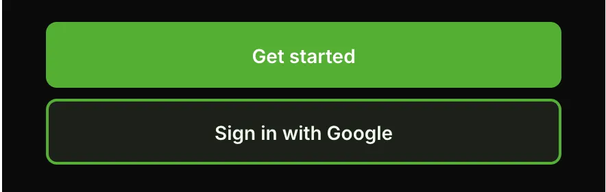
In both the light-alt & dark versions you can see a tint of the brand colour coming through while still being mixed with the background colour. The button text is now set to --color-text-primary , which is a global token that changes based on the background colour, so it’s always going to be legible.
This allowed me to have design elements that adapt nicely to their context – the button background remains mostly transparent, and the text is always legible. I also don’t have to write some crazy CSS rules and further lock down the system. Win-win 🥳.
Further enhancements
If I wanted to spend more time on this project to flesh out the system, I would add more theming options, such as:
- Elevation – to allow theming for more flat designs and ones with shadows.
- Fluid typography – to handle typography that changes between breakpoints
- Spacing – to allow for tighter or looser spacing.
- Figma variables – to create a component library using variables that the code reflects
However, in the interest in not letting this project get too bloated, I’m keeping it simple. Perhaps I’d run into issues adding on more layers to the theme, but I’m happy with how it turned out.
Have a play around with the proof of concept yourself, and let me know what you think!